PERSONAL INVESTIGATION

MY FAVOURITE IMAGES SO FAR


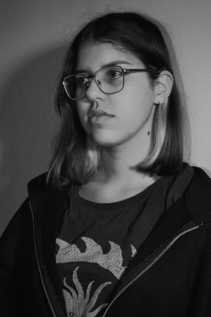

I've chosen these images as my favourites since starting the course in September. The different style of shooting and editing showcases my view on photography and how I feel that you should never restrict to only one style or stay inside your comfort zone. Photographs are time capsules and I love using theory to the advantage and taking images of situations or places that I know will be different when I look back in the future.
PHOTOBOOK ANALYSIS
FLAGS FOR COUNTRIES THAT DON'T EXIST BUT BODIES THAT DO
RENE MATIĆ
RENE MATIĆ


Rene Matić crafted this book following their life living in South London with their family and friends. The book is so comforting and allows the reader to be apart of Rene's life. The book almost welcomes the viewer into Rene's life portraying some of their and their friend's intimate moments. In the third image you can see a blank page, this was a simple yet effective method Rene did throughout the book to separate all three years of the project. Furthermore, the use of the handwritten letter on the last page conveys the idea of the book being a time capsule Rene has presented to the world.
At first glance of the book, the cover is quite confusing, to someone who doesn't understand it's just a black and blue image but as you flick through the pages you see the full image on a page. The font of the title shows that it will be an informative - following the look of the dictionary, however this book is informative in a different way. The book teaches the viewer the meaning and importance of life, remembering and embracing every moment even if it doesn't seem that interesting the moment.
Rene's images stand out because they're so personal and tell a story only Rene understands. The way the images are shot so pure whilst still being aesthetically "grungy", the mixture of the style creates a unique and individual atmosphere for the book. The book completely communicates Matić's intentions of portraying their authentic life in all aspects, the interesting, uninteresting and more. The style of photography and camera technique fully suits the style and subject through the book, in the one of the images we can see Rene in the mirror showing the camera behind the project - Nikon 35mm it appears. I admire this photo book and Rene's style of work, it is so personal yet creative and invites the viewer almost as if Rene is telling a story through the pages.
This book was the perfect book to be given to be and really fits my aesthetic and view on photography as a whole - using every opportunity to take a picture.
EXPERIMENTING WITH FILM


In lesson, I was given the opportunity to use one of the schools cameras to experiment with film, the camera was a Fuji Instax 300 with black and white film. As I had just previously been looking through Rene Matić's book, I had an idea of what I wanted to look like without completely copying their style. I asked a friend if she could pose as a model for my experiment and we walked to different places around school where I could take some pictures.
The first image was a simple test round, me trying to understand the camera and how the light works with it. After printing, I'm not sure if it was basically I was handling with it too roughly, but a red mark appeared. As much as it is confusing, it does create a vintage and used look to the image. The middle image is my favourite at of three as it turned out exactly how I wanted it to be. I placed my friend in front of the window to create an image that portrays the contrast of light and shadow. With the light shining through and the buildings in place multiple outlines are shown in the picture to help explain my intention behind the image. The last image definitely conveys my inspiration from Rene, with my friend the main subject of image but not engaging with the camera. I liked this image however, I there wasn't much difficulty or skill behind that I could feel satisfied off. I liked it but it doesn't present my understanding and challenges in photography.
Overall, I enjoyed this small task and learning how to use different types of cameras, next time I do an experiment involving working with new cameras, I will have a clearer vision for what images I want to take and for how I want them to look.
IL MALOCCHIO
ANDREA SIMONATO
ANDREA SIMONATO


IL Malocchio translated to "The Evil Eye" in english, is a photography book created by the Italian artist Andrea Simonato. The images are a showcase of his home town in North Italy, Vicenza and its believed curse on the town making it unlucky, abandoned and decaying. The images appear dark and simple fully conveying the look of the towns curse. The black and white filter edited over further portrays the mystery embedded in the images. These images are similar to my experiment with film I did a week prior with the b&w and simplicity of the pictures. Andrea did a great job of highlighting the need of hope in the place people call home.
|
BLIND SPOT
TEJU COLE We were given a task to research an artist named Teju Cole who crafted a photography book called 'Blind Spot'. Our teacher sent us a link to an interview he did explaining the situations he was in and overall how the book was created. |
|

|
Cole was informed that he had developed a condition known as 'Big Blind Spot Syndrome' after experiencing multiple complications with his vision in his left eye, the idea of the book had fallen on the tip of his nose as he had been interested in the phrase 'Blind Spot' prior to the situation. After overcoming and pushing through the difficulties, Cole realised that the ability to look is sacred; even those that do not appear to be "exciting" should indeed be appreciated in his photography. Cole created the photo book with his strong Nigerian heritage and love of travelling the world, appreciating the contrast of all the places depicted in the images.
|


Cole shares the story behind his pictures and their descriptions, it a powerful way for him to connect with his audience and share his perspective. He also provides a short story from another source, for example the Bible which is a peak inside Cole's mindset whilst creating the book. In his short film, Cole discussed any challenges he faced while taking the picture, any specific techniques he used, and how his vision influenced his choices. Whilst also talking about the emotions and messages he was trying to convey through the book. By sharing his personal story and unique perspective, Cole's influence on others brought attention to the importance of not thinking too much before taking a picture, not waiting for any opportunity and just taking it as soon as you see it.


Here are some screenshots of images from Blind Spot, I love Cole's simplistic yet effective style of photography that catches the viewer's eye. With the understanding of his love for travel, Cole has elegantly conveyed his travels and the contrasts in the destinations, for example images of the streets of Nigeria paired next to the snow and mountains in Switzerland. His work and book are both very clean and eases the viewer into looking through more.
MAKING DAY
ON THE FLOOR
ON THE FLOOR
For the Making Day we had to investigate our personal lives and how we can convey it in our work with the goal of our images being difficult to recreate. We had three hours to travel anywhere we desired and come up with a project, I decided to visit my dad's old music studio in Brixton where I spent a lot of time growing up. In the office, I found all of his old equipment, vinyls and personal elements. Although many people have seen a lot of this equipment before and they can go and take their own pictures of it, there are many deep, sentimental stories behind each photograph and object. I made the images darker to portray that this era in my family's life is over and the title On The Floor has a deep meaning between my parents and I, so I thought it was appropriate to title the project that as it links perfectly.
UNEDITED IMAGES


EDITED IMAGES
I used VSCO Cam to edit my images, I played around with the levels of exposure making them a bit brighter, I added some grain onto the images to give them a gritty look, fitting the aesthetic of the old school music style. I played around with the HSL making certain colours pop in the dark images. Overall, I am a big fan of how the edited images turned out and I feel like they fully upgraded and cleaned them nicely.


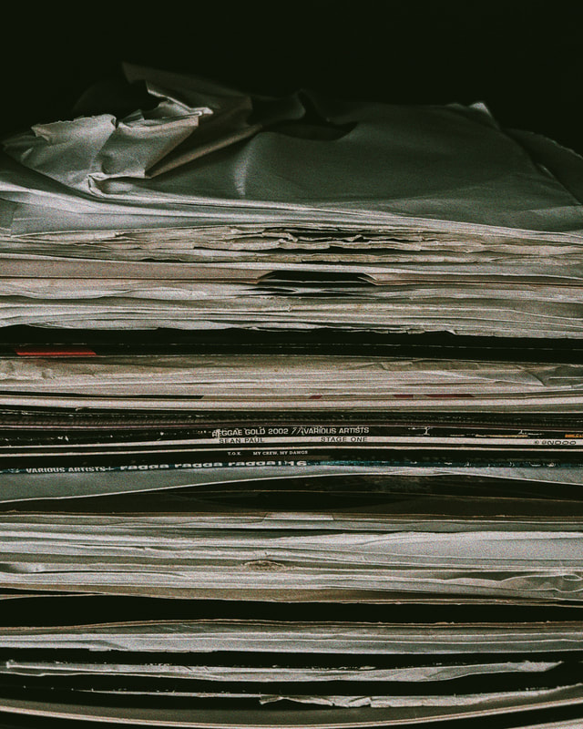


I really enjoyed creating this project and I feel like I confidently conveyed my passion for this project with clear shots and appropriate editing. I like how the images turned out as whole and I am a fan of the layout of my gallery. I'm a big fan of the lines and structure in the images however I am not going to continue on this project as this time in our lives is over and this project is like an archive, visiting the past. I like the idea of having projects based around archives to do with my family and personal life, visiting times that are now over. At home we have plenty of old images of our family that are stacked up, that look similar to the images of the vinyls. Possibly, I could incorporate the images from home with the music pieces.
UDARNY TRUD
PAULINA KOROBKIEWICZ
PAULINA KOROBKIEWICZ
|
|
Paulina Korobkiewicz is a Polish photographer, when visiting back home she stumbled across an abandoned building which was in use during the Soviet Union timeline. When looking through the all of the empty rooms, she found plenty of images of those who worked in the offices at the time, with these images, she was able to recreate and construct a gallery, with images of the rooms, the work that was left and mixtured pieces of material leftover and the images of people from the office. Personally, my favourite images are of the abandoned offices and also the old images placed on top of the materials. This idea of archives is very appealing to me and I will be taking a lot of inspiration moving forward. |


IMPLEMENTING MY JOB INTO MY SCHOOLWORK


During the half term and on the weekends, I have a job as a photography assistant. With a mixture of work and school, I learn much more about photography each day. I thought it would be a good idea to implement some of my personal work into my personal investigation for school. With work, I have a very specific style of picture that I have to follow, when taking images, I have to remember the rule of thirds, making sure the subject is in the centre of the image and more. The strict rules have helped me to improve the way I take images, making them cleaner and look more professional. With working in photography, it has enhanced my editing skills. When using VSCO Cam, it is a simple yet effective way to strengthen the images and pull them to their best potential. I love working with brightening and lowering different levels of colour and exposure and also adding elements such as 'Grain' to add a personal touch of my style in my work.
MY RAMADAN COLLECTION
The past month it has been Ramadan and I've been fasting. This time is the month spiritual time in a Muslim person's life, bringing them closer to God and their community. As my energy was quite low throughout the month due to fasting, I didn't have much power to go out during the day however, I spent a lot of time in my local Mosque, Muslim owned shops, with my Muslim family and friends and overall places that helped me with my religion and fasting.
I thought it would be a good idea to document my time in this years Ramadan as it is such a personal time and no Muslim will have the same experience and it also a good way to highlight the beauty and importance of Ramadan and battling the stigma that lies around it. I took a lot of inspiration from Rene Matić with the mindset of carelessly taking a picture, not waiting for the right moment or setting anything up, just simply letting the authenticity of the image speak for itself.
I thought it would be a good idea to document my time in this years Ramadan as it is such a personal time and no Muslim will have the same experience and it also a good way to highlight the beauty and importance of Ramadan and battling the stigma that lies around it. I took a lot of inspiration from Rene Matić with the mindset of carelessly taking a picture, not waiting for the right moment or setting anything up, just simply letting the authenticity of the image speak for itself.


|
@YASWEART I came across an Instagram account named @yasweart that posted images of specifically Muslim, African origins that further pushed my ideas and style of photos for this project. The artist already had a similar style of photography to myself and Muslim and African culture tied it all together. I love their work because it is so effortlessly flawless and enhances the beauty of the religion and culture.
|
    |
TAMI AFTAB
I was introduced to the artist Tami Aftab, a London photographer who specifically takes images in portraiture, fashion and her personal practices. When looking through Aftab's gallery, I adored her effortless yet effective look. Her style is editorial yet personal which is very inspiring and her images are simply breathtaking. I love how can capture the perfect moment whilst making it seem so natural. Her style of editing with vibrant colours almost expresses a nostalgic tone in her work, her work almost plays as keyhole into her personal life and experiences. As it is moving into the summertime, I will take inspiration from her work with her bright, enlightening editorial yet natural style.


WOMEN LIFE FREEDOM
HODA AFSHAR


To expand on my Ramadan Collection work, I took inspiration from the artist Hoda Afshar and her work titled 'WOMEN LIFE FREEDOM' at the Peckham 24 exhibition. She created some large prints of images she had taken of women protesting in Iran. I loved the rectangular, large display should printed them onto and how she displayed them.
In my lesson, I thought I would just try at with printing one of images big and placing it on the wall, just to see if I liked how it looked and to understand the process. I printed the image I took in Regents Park Mosque as it is my favourite from my Ramadan Collection.
When I was trimming the images, I cut about too much on one which left a small gap in the middle and ruin the image overall. Besides the small mistake, I am appreciative on learning the process of learning how to print my images into the A1 size. However, I don't think I will return to large printing for now, possibly I can when I have a different style of image, a more grungey, dark picture that I can work and expand on. I think a colleague of all the 'Ramadan Collection' images may be more appropriate as all of the images have a small link that brings them all together.


